A few equity indexes are starting to look like this chart, from 2007.
Back then the problems in US housing were starting to mount and in July/August we got a sharp selloff in stocks, including 7% in the S&P 500. Then, it recovered to touch a marginal new record high that autumn, and ultimately the worst bear market in decades, culminating in a decline of more than 50%.
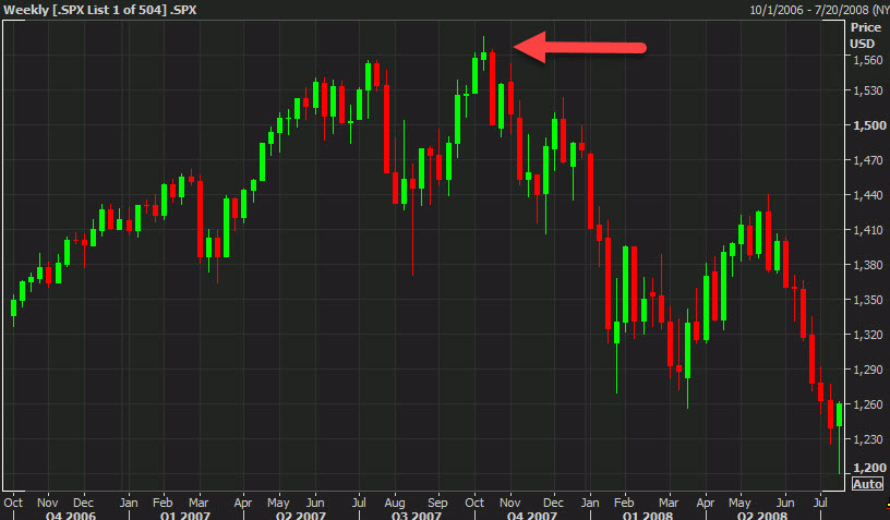
I remember that new high vividly and thinking that the market was signaling that Fed cuts would be enough. I certainly wasn't convinced then and the bearish engulfing candle on that weekly chart was a strong signal to head to the sidelines.
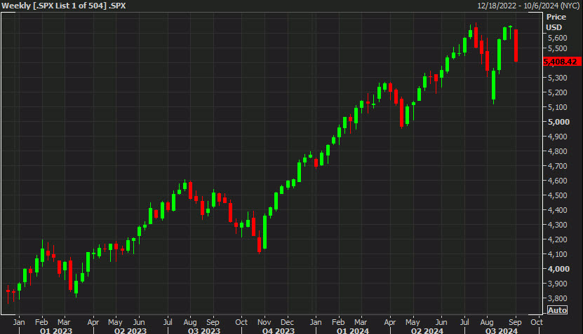
How does the weekly chart look now? We got a slightly larger 9.2% decline in July-August and rebounded more quickly. Of course, we didn't get a new high in the S&P 500, though many global equity indexes did, including the DAX and Toronto TSX Comp. The latter looks particularly like the 2007 chart but the S&P 500 is also flashing a real reversal pattern and the failure to break the July high is a double top.
Unlike in 2007, I can't make a compelling case for why stocks should tumble and I certainly don't see a financial crisis on the horizon. That said, I can think of a few reasons for a tumble from here:
- Sept seasonals are poor, it's the worst month
- The Fed isn't likely to cut quickly enough and is already behind the curve
- The AI trade looks like it wants to take a break
- Valuations are much higher than they were in 2007
- The election is in 59 days
- Fund managers are sitting on health YTD gains (or at least they should be)
- Bonds are still offering a decent alternative
With futures posting a nice bounce today, note that the next weekly candle on the 2007 chart was good before it all fell apart.